If you’re an e-commerce business owner considering a website redesign or constructing a new web page, you’ve likely heard of a development process called “wireframing.” The wireframe provides a basic blueprint of a website’s page interface, similar to an architectural drawing of a building. You may be pondering whether these wireframes should contain colour, as the visual aspects of your brand are indeed critical to its identity. The answer? No, wireframes don’t have color, at least not during the first few iterations.
Wireframes, by definition, typically don’t incorporate flashy colors, complex design elements, or graphics. Instead, wireframes are traditionally created in grayscale, serving as the building blocks of the development process.
Observing a monochrome wireframe, viewers are drawn into its structural simplicity, free from the distraction of different shades on particular elements. The focus is on the clearest form of the page, with each element carrying an equal weight. This forces viewers to contemplate the configuration of elements, their intended behaviors, and how they specifically focus on the UX design rather than their aesthetic appeal.
Shared Language of Simple Wireframes
Wireframes establish a shared language between design teams, users, stakeholders, and developers. Utilizing tools like Adobe XD to create wireframes, they facilitate the translation of design ideas into a two-dimensional illustration of a project’s UI design.

In the early stage of a project, wireframes are especially crucial as they depict the information architecture of the design, highlighting the space allocation of particular elements. Wireframes balance complexity and simplicity, providing sufficient feedback to all parties without overwhelming them with excessive details or intricate design language.
If you are wondering how many wireframes you would need for a website project you may want to check our article on How Many Wireframes Do You Need When Building a Website?
Types of Wireframes
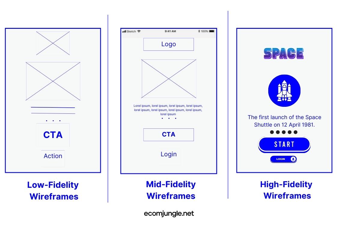
There are different types of wireframes, but the two main ones are: low fidelity and high fidelity.
- Low fidelity wireframes are rough sketches, lacking detail but clearly outlining the fundamental content elements. Its primary purpose is to visualize basic functionalities and to establish a user journey.
- High fidelity wireframes are more detailed and specifically focus on the project’s interactive elements, including hover states. While they still don’t depict the visual design in its final form, they often include features such as fonts and different shades, offering a closer representation of the final design.
For more detailed insights into how to create these wireframes, check out our guide on How to Create Wireframes.
What About Branding?
But shouldn’t colors, which are part of my brand’s visual appeal, be included in the wireframes? While it’s true that colors play a crucial role in shaping your brand’s persona, wireframes, originally published in grayscale, are more about form and function rather than aesthetics.
Consider wireframes as the initial stage of your website’s design. You would first focus on the structure, ensuring it’s strong and logically organized. Once that’s established, then comes the fun part: applying the colors, textures, and other design elements that bring your brand to life.
The greyscale used in wireframes allows designers to prioritize usability and function above aesthetic appeal. By using varying shades of grey, one can distinguish different elements, delineate sections, and imply hierarchy without the distraction that color might bring.
Once these aspects are finalized, then the colors that align with your brand identity can be added in the subsequent design stages, bringing to life the vibrant hues that eventually define a brand and client expectations.
To illustrate this point, think about Amazon’s website. Its wireframe would first define the placement of the search bar, product listings, and checkout button—key elements that make it a functional e-commerce site. Only after this functional layout is established would the familiar orange and blue hues be applied, lending the site its recognizable branding.
What Are The Colors Used In A Wireframe?
As we discuss the particulars of wireframe color schemes, it’s crucial to understand that the essence of a wireframe is simplicity and clarity. When creating a wireframe, the primary goal is to define the fundamental structure and layout of a webpage, leaving out distractions such as color and graphics.
To maintain this focus, wireframes traditionally employ shades of one color: grey, making them greyscale. The use of greyscale in wireframes is both strategic and practical.

It allows designers to prioritize usability and function above aesthetic appeal. This choice of color—or lack thereof—keeps everyone’s attention on the placement and interaction of elements, the hierarchy of information, and the user flow. By using varying shades of grey, one can distinguish different elements, delineate sections, and imply hierarchy without the distraction that color might bring.
To add a bit more detail, wireframes often use dark grey to represent text or other prominent features, mid-tone grey for secondary information or less critical elements, and light grey for borders or placeholder content.
For instance, a wireframe for an e-commerce site might use a darker grey for product names (indicating importance), a medium grey for product descriptions (secondary information), and a lighter grey for image placeholders. This approach helps to communicate the relative importance of different elements and how they should function together.
So, in essence, while wireframes may lack the vibrant hues that eventually define a brand, the greyscale used serves a vital role in establishing a website’s underlying structure and functionality. Once these aspects are finalized, then the colors that align with your brand identity can be added in the subsequent design stages.
Do Mockups Have Color?
Mockups serve as the next evolutionary stage after wireframes in the web design process. Where wireframes are about structure and functionality, mockups bring in visual design elements, offering a more tangible and realistic representation of how the final website will appear. They incorporate colors, typography, images, and style details, painting a comprehensive picture of the eventual user interface design.
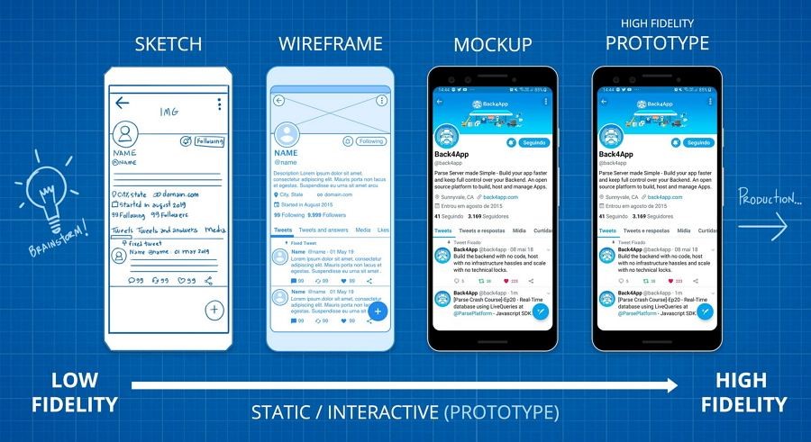
In the context of e-commerce, a mockup would showcase actual product listings, complete with images, descriptions, pricing, and ‘Add to Cart’ buttons. These elements are displayed in line with your brand’s colors and design identity, providing stakeholders with a near-final version of the website’s look and feel. Thus, mockups bridge the gap between the skeletal wireframe and the fully developed website, adding a critical layer of visual refinement before the actual development begins.
Takeaways
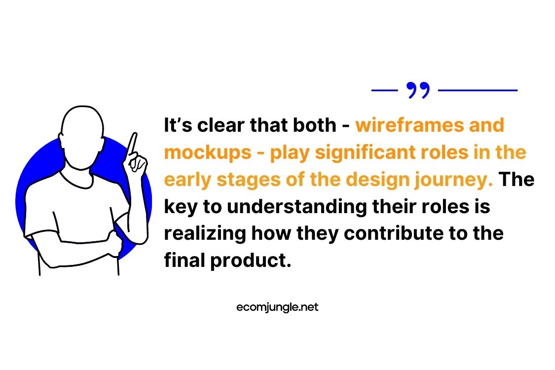
Navigating the world of website design, particularly in the e-commerce realm, can be complex. UX design process is a balancing act between functionality and aesthetics. As we’ve delved into wireframes and mockups, it’s clear that they both play significant roles in the early stages of the design journey.
The key to understanding their roles is realizing how they contribute to the final product. Let’s highlight some main takeaways:
- Wireframes, in the best wireframe style, serve as the structural blueprint of a website. They specifically focus on the layout and functionality rather than on the visual elements that color the interface.
- Typically wireframes are created in grayscale, which allows UI designers and clients alike to maintain focus on structure and functionality. These wireframes are free from distractions like color, graphics, or detailed design elements.
- Utilizing greyscale wireframes allow designers to establish a hierarchy and delineate sections. This is achieved by using varying shades of grey to differentiate between certain elements.
- While wireframes form the skeletal structure of a website, mockups are the ‘skin.’ They provide a realistic, detailed preview by incorporating color, typography, images, and style elements, moving a step further from a low fidelity wireframe toward the final design.
- The UX design process usually progresses from wireframes to mockups. This progression ensures a focus on solidifying structure and functionality before delving into the detailed visual design that colored wireframes depict.
For the tools that can help in creating wireframes, check out our guide on the Best Wireframe Tools In 2023.
Conclusion
Wireframes and mockups both serve as integral threads in the complex tapestry of web design. Each contributes uniquely to the overall picture.
By understanding their distinct roles and strategically employing them in the design process, e-commerce business owners can create websites that are not just visually engaging but also highly functional. It’s about striking a balance between aesthetics and functionality—ultimately, that’s what defines the success of your online presence.
Frequently Asked Questions
Wireframes typically utilize a select palette, including black, gray, white, and occasionally red. Black outlines the structure and key elements, while gray is applied to text and lesser important elements to establish a visual hierarchy. White is used as a contrast color, often labeling dark buttons or creating spaces of separation. Red, sparingly used, is primarily for highlighting error messages or crucial notifications.
A wireframe and a design denote two different stages in the process of creating a website or an application. The wireframe outlines the basic structure and layout, focusing on essential elements and functionality. Conversely, the design phase brings aesthetics into play, transforming the wireframe into a visually engaging representation of the final product by adding colors, typography, and style elements.
A wireframe’s format is a simple sketch of a webpage or application interface. Using lines, boxes, and grayscale colors, it represents various page elements. Despite no strict format rules, wireframes are typically devoid of color, detailed design elements, or actual content, instead using placeholder text and simple shapes to represent different elements.
Indeed, wireframes do incorporate images, but as placeholders rather than actual pictures. These placeholders, depicted as rectangles with a cross or diagonal lines, stand in for future image content. This practice is primarily due to the fact that specific images are usually selected later in the design process when the focus shifts from structure and functionality to aesthetics and user engagement.