In the vast and dynamic world of user experience and web design, many tools and techniques are available to transform an idea into a fully functioning digital product.
Among these, one powerful tool stands out for its simplicity and effectiveness, often serving as the first tangible visualization of a concept: the wireframe.
In this article, we’ll delve into the world of wireframes, illuminating their role, purpose, and the critical elements they should encompass. We’ll explore how this step of the product life cycle can help bring clarity to your design process, streamline communication within your team, and ultimately save you time and resources.
So whether you’re a seasoned pro or a curious beginner, join us as we uncover the magic behind wireframes and what you should consider including within them.
What Are Wireframes?
A wireframe is a simplified visual guide that represents the skeletal framework of a website or application, typically used in user experience and interface design to outline the layout and functionality of the site or app without the inclusion of any graphical or textual content. It’s essentially the rough draft of what your website will look like.

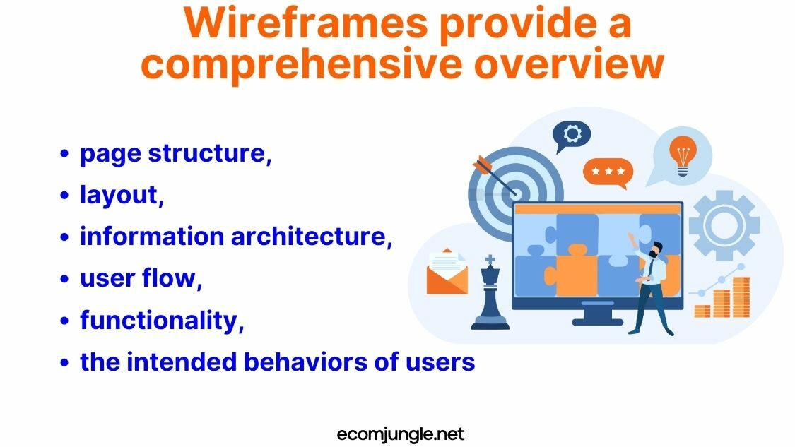
Wireframes provide a comprehensive overview of the page structure, layout, information architecture, user flow, functionality, and the intended behaviors of users. Serving as a visual guide, they map out the step-by-step journey of a user through the digital product, whether it’s a website or an application.
Wireframes are often minimalist in design, with styling, color, and graphics kept to a minimum since they usually represent the initial product concept. Instead, they focus on functionality rather than the aesthetic elements of the final product, hence why most wireframes are simple, with grayscale instead of colors, placeholders for images, and lorem ipsum for text.
When working through the wireframing process, you will create wireframes with different levels of wireframes exactness. This is known as fidelity. Low-fidelity wireframes outline the basic functionality and flow of the website. A low-fidelity wireframe will avoid any use of color and will outline where and outline how much space different components will take up. High-fidelity wireframes invoke more detail and pixel accuracy and are created digitally with wireframing tools.
What Is The Purpose Of Wireframing?
Primarily utilized in the early stages of the design process, wireframes allow UX designers to communicate their product design ideas effectively.
They help map out the functionality of the pages, facilitate design discussions, and enable early detection and rectification of potential issues. This adaptability makes wireframes an invaluable tool that saves time by making adjustments easier and less resource-intensive.

Wireframes address several common challenges in the design process:
- Enhanced Estimation Accuracy – By presenting a clear overview of the product’s structure, functions, and user interactions, wireframes enable a more precise estimation of the time and resources required for the product’s development. This understanding helps project managers to distribute resources more effectively and set realistic timelines, reducing the risk of overspending or project delays.
- Improved Communication – Wireframes serve as a shared visual reference point for the design team, developers, and stakeholders. They help in efficiently communicating design ideas, user flows, and functionality of the product. This clarity ensures that everyone involved in the project has a unified understanding of the product’s features and functionalities, reducing miscommunication and confusion.
- Clarification of Features and Flow – Wireframes provide a clear layout of the screens and the connections between them, demonstrating how users will interact with the product. This clarity prevents potential misunderstandings about the product’s functionalities, ensuring a smoother development process and a more user-friendly final product.
- Capital Raising – When seeking investment, wireframes can be extremely beneficial. They provide a tangible, visual representation of the proposed product, allowing investors to understand the concept and see the viability and potential profitability of the product, increasing the chances of securing funding. Moreover, they can help differentiate your concept from competitors in the marketplace. A well-designed wireframe can demonstrate a unique approach or innovative features that set your product apart, giving you a competitive edge in the eyes of potential investors.
- Cost Efficiency – Adjustments to a wireframe are less costly and time-consuming than changes made during coding. By identifying and addressing issues during the wireframing stage, teams can avoid costly alterations later in the development process, resulting in substantial cost savings of up to 60% and more efficient use of resources.
- Problem Identification – Wireframes allow design teams to gather feedback early in the design process. This can help identify problems and allows for timely rectification, preventing these issues from escalating into more significant problems that could negatively impact the user experience or increase development costs.
- Understanding Cost Impact – By outlining the structure and features of the product, wireframes facilitate a better understanding of the cost implications associated with each feature or screen. This understanding aids in budget planning and helps decision-makers prioritize features based on their cost, importance, and impact on the user experience.
What Is A Wireframe Map?
A wireframe map, also known as a sitemap or site flow, is a visual representation that shows the relationship between different web pages or screens within a website or application. It’s an important tool in the user experience (UX) and web design processes, extending the concept of individual wireframes to a broader, more holistic view of the entire product.
In essence, a wireframe map illustrates how different pages or screens connect to each other. It’s a guide that shows how users can navigate from one part of the site or app to another, creating an overall picture of the user’s potential pathways. It’s a way to understand the sequence of user interactions or flow and to ensure that the user can easily complete their intended tasks.
While an individual wireframe focuses on the layout and functionality of a single page or screen, a wireframe map connects these individual elements into a coherent, interconnected design. It outlines the hierarchy of pages, showing which pages are main pages and which are sub-pages. It also shows how the user can move between pages, indicating the possible routes a user can take to get from one page to another.
Difference Between Mobile and Website Wireframes
Wireframes are foundational tools used in the design process across different platforms, including mobile and desktop websites. Despite their common purpose, there are distinct differences between these two, attributed primarily to the differing contexts and user interactions they cater to.
What is Website (Desktop) Wireframing?
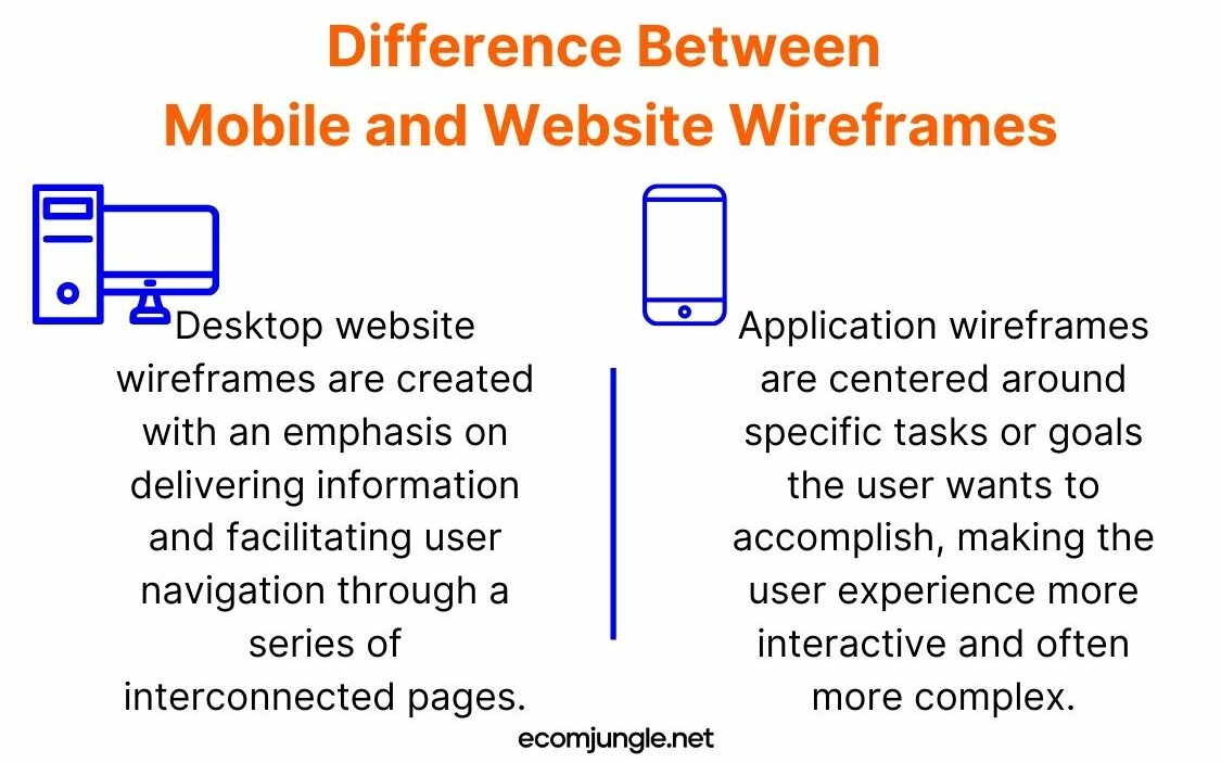
Desktop website wireframes are created with an emphasis on delivering information and facilitating user navigation through a series of interconnected pages. Design elements such as headers, footers, navigation menus, and content blocks are highlighted, which assist users in seamlessly navigating through the site and accessing the needed information.
The user journey in desktop websites is typically more linear, with a clear pathway from the homepage to deeper content pages. Moreover, these wireframes must incorporate responsive design principles to ensure that website layout and content flow logically and efficiently on different screen sizes, ranging from larger desktop displays to smaller laptop screens.
An integral part of desktop wireframing is the careful planning of messaging. The information presented on each page and the order in which it is delivered significantly impact user engagement. The more meticulously this messaging is crafted during the wireframing stage; the fewer adjustments will be required later, resulting in a more streamlined design process.
Furthermore, desktop wireframes must strive to reduce user friction – any elements or features that might impede the user’s experience or erode their confidence in the website. By identifying and eliminating these points of friction during the wireframing stage, designers can increase user engagement and conversions.
What is Mobile Wireframing?
In contrast, application wireframes are centered around specific tasks or goals the user wants to accomplish, making the user experience more interactive and often more complex. Applications are typically more function-oriented, with wireframes that detail interactive components such as buttons, forms, sliders, and gestures.
The user flow in an app can be multi-directional, with users often needing to navigate through multiple screens to complete a task. Mobile wireframes must take into account different states of interaction (like loading, success, or error states) and consider the limitations and advantages of the specific platforms they’re designed for, like iOS or Android.
Due to the limited interface size and space constraints inherent to mobile devices, it’s imperative to adopt a minimalist design approach that emphasizes clear and straightforward navigation.
Special Gestures And Motions
One key aspect that sets mobile app wireframing apart is the consideration of special gestures and motions exclusive to mobile devices. For instance, interactions like pinch-to-zoom or swipe gestures, which aren’t typically found on desktop interfaces, play a significant role in the mobile experience and should be contemplated in the wireframing stage.
Screen Size
The smaller screen size of mobile devices also impacts wireframe design. The limited real estate necessitates a more minimalist approach to design, with a focus on clarity and unambiguous navigation. Avoiding cluttered elements is crucial to prevent an “endless scrolling” situation and to ensure a user-friendly experience. This doesn’t mean that the design needs to be starkly minimalist, but it does require thoughtful placement and prioritization of elements.
User Inputs
Wireframing for mobile apps also involves designing for efficient user input. Typing on a mobile device can be cumbersome, so forms should be designed to require the least amount of user input possible. Collapsible menus, or accordions, can also be used to manage extensive information on smaller screens.
What Elements Should You Include In A Wireframe?
While wireframes may seem basic initially, they encompass a multitude of crucial elements that serve as a blueprint for the website’s layout and functionality. These components not only define the allocation of space but also establish the content hierarchy and delineate intended user behaviors, such as potential interactions with call-to-action buttons.
As you design a wireframes you will likely utilize one of the popular wireframing tools on the market. It’s essential to understand what specific components should be included and which ones are not necessary for your wireframes. The primary focus should be on structural elements rather than specific design details.
Wireframes usually incorporate components like the logo, search field, breadcrumb navigation, and headers (with the main page title as H1 and subheads as H2 and so on). Other elements include global and local navigation systems, body content, buttons, contact information, contact forms, and the footer.
These components serve to provide a basic visual guide for the layout and functionality of your page, assisting in the creation of an intuitive and user-friendly design. Below is a table that offers a clear distinction between the essential elements that should be included in a wireframe and those that should be excluded, in order to ensure a focus on structural components over specific design details:
| Elements You Should Include | Elements You Shouldn’t Include |
| Page Layout and Structure – Your wireframe should outline the basic layout of the most important pages, including where different elements will be positioned. This number will be different depending on the complexity and type of project. | Wireframe for Every Page – While each page of your website or app may have unique layouts and functionalities, not all need to be wireframed. Only create wireframes for key pages to provide an overview of the user journey. |
| Gray Tones – Instead of using colors, you should rely on various shades of gray to distinguish between different elements. | Colors – Colors can detract from the structural elements you’re attempting to focus on, so they should be excluded from your wireframe. |
| Placeholder Graphics – Images and icons should be symbolized by vector design shapes, like rectangles or circles, often with an ‘X’ through them to indicate their intended placement and size. | Images and Icons – Use placeholders to represent these elements rather than actual images or icons. |
| Placeholder Text – Instead of actual text, you should use horizontal lines or ‘Lorem Ipsum’ to represent where the text will be placed. | Real Text or Copy – Text can also be distracting, so it’s better to use ‘Lorem Ipsum’ or horizontal lines as placeholders. |
| Generic Font – Typography discussions should be saved for later in the design process, so only one generic font should be used in your wireframe. | Different Fonts – To keep the focus on the structure and layout of your page, avoid using different fonts in your wireframe. |
| Basic Shapes for Interactive Elements – Call-to-action buttons and other interactive elements should be represented by simple shapes like rectangles or circles. | Call to action buttons – Don’t spend time creating CTA buttons. Simple shapes work fine for wireframes. |
| Simple Button Representations – Instead of designing buttons for wireframes, stick to rounded shapes or differentiate button elements with a darker gray color. | Buttons – Skip fully designed buttons for a more simple shape or color. |
| Subtle Gray Backgrounds – While wireframes should avoid detailed backgrounds, a subtle gray background is often used to provide contrast and clarity for other elements. | Backgrounds – Backgrounds can also detract from the structural elements, so they should be omitted from your wireframe. |
Following these guidelines can help you create effective wireframes that clearly communicate your design concepts and interface elements, laying a solid foundation for further design stages.
Pro Tip:
Keep in mind that wireframes, being two-dimensional, are limited in their ability to display interactive aspects of your webpage or application, such as menu systems, hover states, or dynamic elements like content accordions.
In a wireframe, elements like images, icons, and text are represented by placeholders, such as rectangles or circles for graphics and ‘Lorem Ipsum’ or horizontal lines for text. These placeholders, distinguished by varying shades of gray, help to focus on the structural aspects of the layout, avoiding the distractions that actual images, icons, or text might introduce.
Interactive elements such as call-to-action buttons are also represented by simple shapes, often with a slightly darker tone for differentiation. While detailed typography and button design discussions are reserved for later stages, a generic font and simple shapes for buttons are more than adequate for a wireframe.
Other common elements found in wireframes include search fields, breadcrumb trails, show hide functionality, headers, and buttons. Some wireframes also incorporate navigation systems, contact information, and footers.
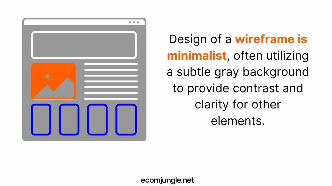
The overall design of a wireframe is minimalist, often utilizing a subtle gray background to provide contrast and clarity for other elements. Detailed backgrounds, different fonts, and colors, which could detract from the structural focus, are intentionally avoided in this phase. This simplistic approach ensures that the wireframe effectively communicates the primary design concepts and user flow, providing a strong foundation for the more intricate design stages that follow.
Takeaways
Venturing into the world of wireframes can be both exciting and challenging. Before we wrap up, let’s underscore four pivotal takeaways that will help guide your wireframing process:
- As a tool in UX and web design, wireframes serve as your first tangible representation of a concept. They allow you to prioritize functionality, layout, and user journey over aesthetics.
- Utilizing wireframes can improve communication within your team, enable early identification of potential issues, and assist in accurate project estimations. This can save you considerable time and resources in your design process.
- When designing wireframes, remember that simplicity is key. Use placeholders and prioritize structural components like search fields, breadcrumb trails, headers, and placeholder text.
- Avoid elements that could divert attention from the layout, such as colors, images, or multiple fonts. Your wireframe is a fundamental guide, not the final design.
Conclusion
Wireframes are more than just preludes to a polished product; they are an effective tool for establishing a shared understanding within a team, setting the stage for a smoother design process, and delivering an end product that aligns with the user’s needs.
The beauty of wireframes lies in their simplicity. They strip away the distracting glitz and glamor of design elements, allowing the core functionality and structure to shine through. This fosters a more focused approach to the design process, ensuring that the user experience remains the centerpiece of all design decisions.
But with this simplicity comes the responsibility of making thoughtful choices about what to include in your wireframes. The balance between providing enough information for clear understanding and not overloading with unnecessary details is a delicate one to strike.
Ultimately, successful wireframing is an exercise in forethought, precision, and mindfulness of the user experience. As you embark on your wireframing journey, keep these principles at the forefront, ensuring that your wireframes serve as effective roadmaps to compelling, user-centered design.
Frequently Asked Questions
A basic wireframe serves as a two-dimensional representation of a webpage’s interface, explicitly highlighting how space is allocated, how content is prioritized, and what functionalities are available. The goal of a wireframe is to map out intended behaviors without getting bogged down in the specifics of visual aesthetics like style, color, or graphic elements.
Wireframes are typically crafted early in the design process, preceding the detailed visual design phase. The advantage of creating wireframes at this early stage is that it allows for significant changes to be made more comfortably, as the focus is not yet on aesthetic elements but instead on content placement and overall functionality.
An effective wireframe prioritizes the placement of content and the pathways for user interactions rather than focusing on visual aesthetics. It is crucial to resist the temptation to beautify wireframes, as this could potentially delay future iterations of the design and introduce confusion during user testing stages.
In a wireframe, images are typically represented as placeholders, often shown as rectangles with a cross. This can denote one of two things: either the specific images are yet to be selected as part of the later stages of the design process, or the images will be user-generated, and thus, the designers don’t need to showcase specific images at this stage.
The stage that follows wireframing in the UI design process involves developing more detailed elements. Wireframes intentionally exclude many visual elements to maintain focus and efficiency in the early stages of design. However, once wireframes are completed, it’s time to revisit these elements, refining and consolidating the visual design, which usually culminates in the creation of detailed mockups.